Brick or Stone: How Facade Materials Set a Wall’s Visual Rhythm
Compare brick or stone facades by unit size, joints and surface variation to understand why one wall reads as lively, calm or strongly patterned.
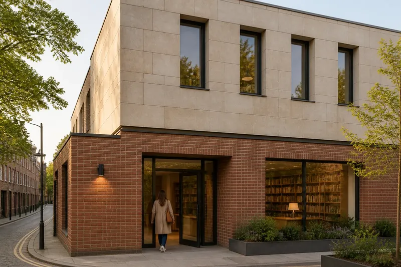
Brick or stone facades can make the same street feel quite different: one wall may seem finely woven, another broad and quiet. If you are choosing between brick or stone for a building’s exterior, look beyond colour and ask how the units, joints and surface will guide the eye across the wall.
Imagine a small library planned for a narrow corner site. Its designers want a welcoming ground floor and a calm upper storey, but have not settled on brick or stone. The following invented situation shows how they might compare the materials by visual rhythm, without treating either as the superior choice.
The unit size sets the pace of the wall
The designers begin with unit size. A facade built from relatively small bricks repeats its edges often, creating a close visual beat. Individual courses and vertical joints become part of the overall pattern, even when the brick colour is consistent.
A stone facade can have larger pieces, so the eye encounters fewer boundaries across the same area. That can make the wall read as more continuous, though the result depends on the stone format and how it is cut. Stone is not automatically large-block or quiet: small pieces can produce a busy surface, while large, regularly sized blocks can feel ordered.
For the library, the team sketches both materials across the same elevation. In the brick version, the repeated courses give the upper wall a fine-grained texture. In the stone version, broader pieces create longer stretches of surface, with fewer interruptions.
They also consider what happens around openings. A window interrupts the repeated pattern of a brick wall, while a broad stone piece may frame or span more of the space beside it. The useful question is not which material looks more refined, but whether the chosen unit scale suits the size and spacing of the building’s windows, doors and wall areas.
Joint patterns make order visible
Mortar joints are not merely narrow lines between units. Their direction, spacing and alignment help the eye read a facade. In brickwork, horizontal courses are usually prominent; the arrangement of vertical joints can make the pattern feel steady, staggered or more emphatic.
Stone joints also form a visible grid, but their effect depends on the block layout. Regularly aligned joints can give a wall a composed, almost panel-like order. A more varied arrangement may make the surface feel less repetitive, while still retaining an overall structure.
At the library, the designers compare a brick bond with a simple, consistent pattern against stone blocks arranged in aligned courses. The brick makes the wall’s horizontal movement easy to follow. The stone makes the larger divisions more apparent, especially around the entrance, where the blocks create a clear visual frame.
They draw the joints on the elevation rather than judging small samples alone. This reveals where a joint line would meet a window corner or continue across a long stretch of wall. The drawing is not a construction detail; it is a way to see whether the pattern supports the building’s shape or competes with it.
Surface variation changes the light and texture
Even units of a similar size can read differently when their surfaces vary. A smooth, even face tends to make the joint pattern stand out clearly. A rougher or more irregular face adds small changes in light and shadow, giving the wall another layer of texture.
Brick can vary in tone and surface from piece to piece, and that variation may soften a regular bond or make it more lively. Stone can show changes in grain, colour or finish across its face. The visible result depends on the material selected and the way its pieces are worked, not simply on whether it is brick or stone.
Say the library team is choosing between a warm, subtly varied brick and a pale stone with a lightly textured finish. They place both sample boards beside a drawing of the entrance. In the imagined comparison, the brick’s varied tones make the repeated courses easier to notice, while the stone’s broad faces make the doorway the stronger focal point. They expect the two samples to produce different readings, not a difference in quality.
Small samples can help with colour and feel, but they cannot show the full rhythm of a facade. A larger mock-up or a drawing that includes several openings and complete courses can make repetition easier to judge. This is particularly helpful when a material’s variation is subtle at close range but may accumulate across a broad wall.
How should you compare brick or stone on a facade?
Does brick always look busier than stone?
No. Brick often has more visible repetitions because its units are commonly smaller, but a tight pattern in small stone can also look busy. Compare the actual unit dimensions, joint layout and surface together.
Which joint pattern looks calmer?
A pattern with fewer strong changes in direction often reads as calmer, but the unit size and contrast between mortar and material matter too. Look at the whole elevation to see whether horizontal or vertical lines dominate.
How can I judge surface variation?
Look at several pieces together, not just one sample, and compare them in the light where the facade will be seen. Notice whether changes in colour and texture blend into a soft field or draw attention to individual units.
Should joints disappear into the facade?
That depends on the intended reading. Joints close in tone to the units can make the wall feel more continuous, while contrasting joints make the grid clearer; neither effect is inherently preferable.
The library’s final choice follows its intended reading
In the invented library scenario, the team keeps the brick at the entrance level, where its close pattern gives the pedestrian-facing wall a tactile, fine-grained character. They choose larger stone pieces for the upper portion, where fewer visible divisions let the windows and the broad wall area read more quietly.
This is a design decision within the example, not a recipe for mixing materials. A different building might benefit from one material throughout, or from a different distribution. The useful lesson is to decide what each part of the facade should do visually, then check that unit scale, joints and surface variation work together.
When comparing brick or stone, it is not worth chasing a perfect sample that promises to represent every piece in the finished wall. Spend that attention instead on a facade-sized drawing or mock-up, where repeated units, openings and joint lines can be judged in context. For any actual project, the product details and installation requirements should follow the relevant manufacturer’s instructions and local rules.